
Even if you’ve never heard the term “dark pattern,” you’ve certainly come across some online. These psychological tricks are used by all kinds of services to influence your decisions and make you take actions that you might not otherwise.
Let’s see what dark patterns are and some forms they commonly take. Being able to spot these methods will give you a better chance of sidestepping them in the future.
Defining Dark Patterns
The term “dark patterns” refers to deliberate design choices, typically in apps and websites, that try to steer your behavior in a certain direction. They are mostly psychological tricks that prey on the human mind. Some types of dark patterns also existed before the days of the internet, while others are more modern.
Dark patterns highlight a particular option the owner wants you to take, hide a choice they don’t want you to make, and add confusion to make your decisions harder. Let’s take a look at a sample of dark pattern types; check out the dedicated resource DarkPatterns.org for more examples.
While the term “dark patterns” has negative connotations, not all instances of design decisions guiding you to a certain solution are bad. We’ll consider some counter-examples of “light patterns” too.
1. Downplaying and Highlighting
Have you ever tried to unsubscribe from a promotional email to tidy your inbox, only to find that the Unsubscribe link was tiny and blended in with the rest of the text? This is an example of a dark pattern.
Since companies don’t want you to unsubscribe from their newsletters, some go to great lengths to make doing so difficult. Even more insidious than simple small text is changing the color of the “unsubscribe” button to make it almost—or totally—invisible.
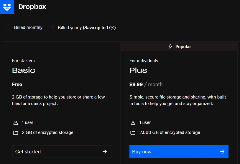
On the other end of the spectrum, it’s common to see services promote the option they want you to pick with colors and exciting language. This is common on pricing pages for apps, where you’ll see Best Value! and Recommended! banners promoting a certain (usually expensive) plan.
When you try to cancel a service, your eyes will naturally be drawn to the colorful No, don’t cancel text instead of the gray Yes, close my account option. What the design chooses to highlight and avoid highlighting is done intentionally to push you in a certain direction.
On the “light pattern” side, a company highlighting its most popular plan can be helpful to newcomers who might not know where to start. This method is also useful for hiding dangerous options, like turning off important account security, so you don’t change them by mistake.
2. Making Cancelations and Changes Difficult
Some in-person subscriptions, such as gym memberships, make it easy to sign up online but impossible to cancel in the same way. You can’t just cancel the membership as you would a service like Netflix; instead, the gym makes you print out and mail a form.
A “lighter” version of this pattern could be used for good purposes. For example, to encourage people to stop smoking, a store might make it harder to locate cigarettes, or require someone to sign a form stating that they understand the health risks. While minor, any barrier you put between someone and a certain behavior could cause them to change their mind.
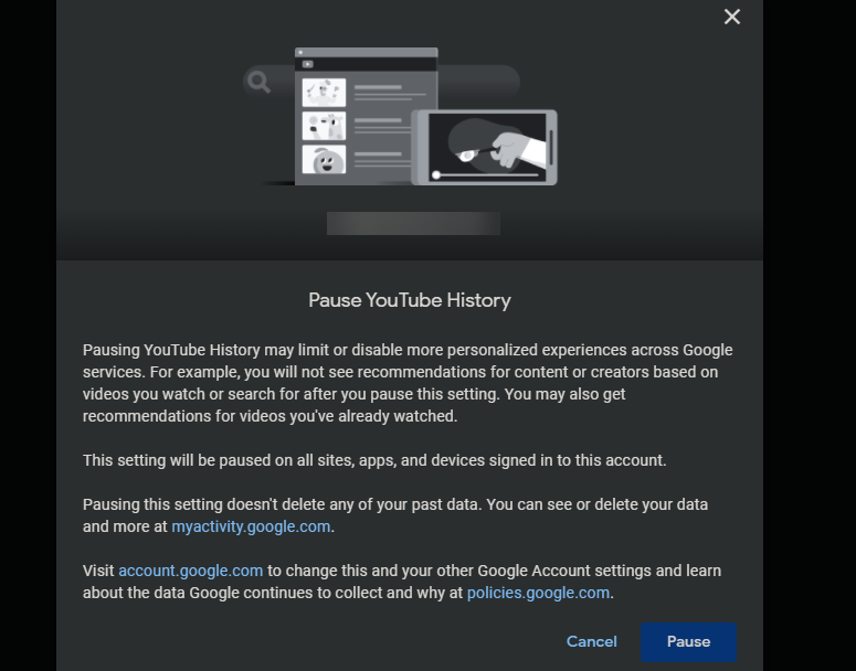
This is a pattern that’s also used online. Social media sites, which don’t want you to close your account, will bury the option to suspend or terminate your account under several menus. Then every step of the way, they’ll ask if you’re sure that you want to do this and show you all the reasons why you shouldn’t cancel. This turns what should be a simple affair into a hassle.
Closing accounts isn’t the only way it manifests, either. Upon trying to change a default option, a window might pop up saying what features you’ll lose if you turn that option off. This might cause you to think twice about the tweak, though it is useful to know exactly what will change if you adjust this setting.
3. Adding Extra Items to Your Cart
In this dark pattern, the checkout process adds more items to your cart than you intended to have. It’s common when registering a website domain, for example—the hosting website adds in all sorts of extra unnecessary features and hopes you won’t notice.
Sometimes these are added with no warning, though they might also be pre-checked boxes that you have to catch and disable.
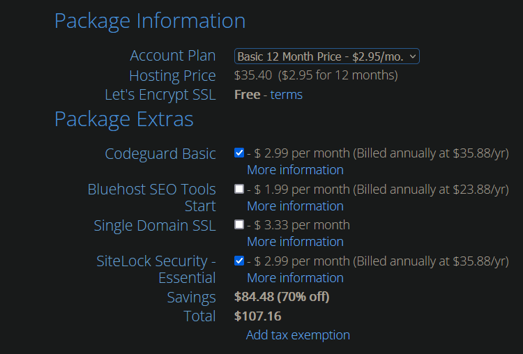
Another form of this dark pattern comes in the form of not revealing extra charges, like shipping or surcharge fees, until you’re ready to complete the checkout. Sites do this in the hopes that by the time you’ve gotten to the final payment page, you’ll put up with paying whatever extra fees they tack on—because it’s easier than going through the entire process again with another site.
This one is dark; there’s really no “light pattern” equivalent to it. The closest analogy is when a credit card machine asks you to round up your purchase for charity. This raises money for a good cause that people might not have given otherwise, but it doesn’t go as far as placing it in your cart without asking.
Before you check out with any online storefront, make sure that you confirm everything in your cart is actually what you wanted to buy.
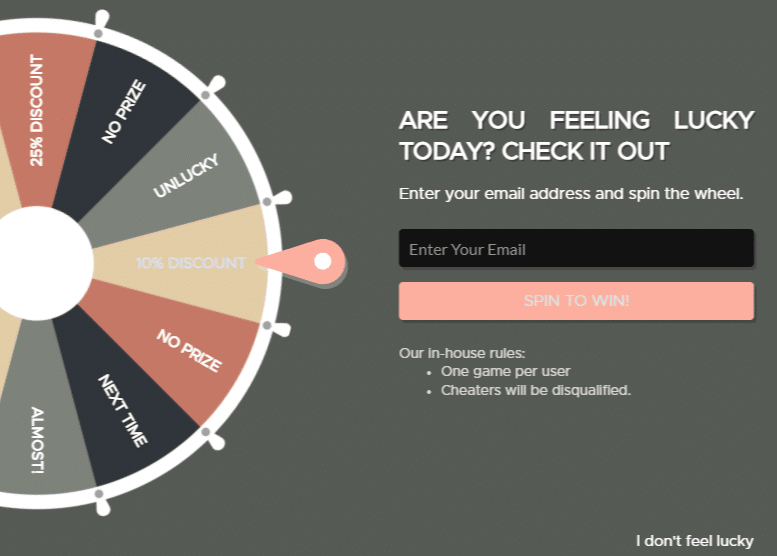
4. Framing Your Options
The words and menus that a site uses can also be an instance of dark patterns. For instance, when presented with a pop-up for a discount coupon if you enter your email address, the decline option might be worded No, I like paying full price for everything. This attempts to shame you for not taking the discount.
You’ll other cases of this when you cancel an account or subscription. Text like “we’ll miss you” tries to manipulate you into staying because you feel bad.
Recognize Dark Patterns
Dark patterns are all over the web and have become so common that most of us don’t even think about them anymore. But remember that a lot of work goes into designing systems that steer your decisions in the way the company wants. Whether those are good decisions or bad depends on your wishes.
Don’t feel pressured by tricks. Take the time to think about your options, and only act when you’re ready. And while you’re thinking about red flags, why not review the major warning signs of phone call scams too?